


Technical analysis is the study of past market data to predict the direction of future price movements. This methodology is considered a subset of security analysis along with fundamental analysis. Here we look at how to use technical analysis in day trading.
It often differs from fundamental analysis, which can be used at both the microeconomic and macroeconomic levels. Micro-level fundamental analysis includes the study of revenue, costs, income, assets and liabilities, capital structure, and “soft” elements (quality of management team, competitive position).
Macro-level fundamental analysis involves the study or forecast of economic growth, inflation, credit cycles, interest rate trends, capital flows between countries, labor and resource use and cyclicality, demographic trends, central bank and political policy and behavior, geopolitical matters, consumer trends and business, and “soft” data (eg, sentiment or confidence surveys).
Some traders may specialize in one or the other while some will use both methods to inform their trading and investment decisions. Most large banks and brokerages have teams that specialize in fundamental and technical analysis.
In general, the better quality information is taken to improve the correct odds, the better trading results are possible.
Technical analysts are often called chartists, which reflects the use of charts that display price and volume data to identify trends and patterns to analyze securities. Price patterns can include support, resistance, trendlines, candlestick patterns (eg, head and shoulders, reversals), moving averages, and technical indicators.

Assumptions in Technical Analysis
Although some traders and investors use both fundamental and technical analysis, most tend to fall into one camp or the other or at least rely on the other more heavily in making trading decisions.
Technical analysts rely on the methodology due to two key beliefs – (1) price history tends to be cyclical and (2) price, volume, and volatility tend to move in different directions. Let’s go through each one individually:
Market Cyclicality
Human nature being what it is, with shared behavioral characteristics, market history has a tendency to repeat itself. The sequence of events is not exact to repeat them perfectly, but the pattern is generally the same. This can take the form of long-term or short-term price behavior.
In the long run, business cycles naturally tend to repeat themselves, such as those driven by credit booms where debt rises inexorably above income for a period and eventually causes financial pain when there is not enough cash to pay off this debt. This tends to produce slow progressive gains in stocks and other “risky” trades (for example, carry trades) during expansions and sharp falls during recessions. Technologists implicitly believe that market participants tend to repeat past behavior due to their collective nature.
If the behavior is indeed repeatable, this suggests that it can be recognized by looking at past price and volume data and used to predict future price patterns. If traders can find opportunities where the behavior is likely to be repeated, they can identify trades where the risk/reward is improved.
Therefore, there is an assumption built into technical analysis that market prices cut out all information that affects a particular market. Although fundamental events affect the financial markets, such as news and economic data, if this information is already or will soon be reflected in the price of the asset when it is released, technical analysis will focus on identifying price trends and the extent to which market participants value certain information.
For example, if the US CPI inflation data reaches a tenth of a percent higher than what the market bought before the news release, we can return the market’s sensitivity to that information by looking at how asset prices react immediately.
If US futures move down X%, the US dollar index increases Y%, and the US 10-year Treasury yield increases Z%, we can get a sense of how those economic inputs affect certain markets. Knowing this sensitivity can be useful for stress testing purposes as a form of risk management.
For example, if inflation is not expected to increase by 1%, we can use data points on the surprise inflation reading to determine how the portfolio might be affected.
Price, Volume, and Volatility Run in Different Trends
Another assumption behind technical analysis (and all securities analysis more broadly) is that prices do not move along a “random path”, or do not follow a clear or logical pattern. Instead it moves in an explainable and predictable trend. For example, if we look at the EUR/USD chart from mid-2013 to mid-2017, we can see how technical analysis plays a role by looking at support and resistance in the context of a trend.
After the euro began to depreciate against the US dollar due to monetary policy divergence in mid-2014, technical analysts may have shorted a pullback to a resistance level in the context of a downtrend (marked by an arrow in the image below).
After the trend fades and the market enters consolidation, a technician may choose to play a range and begin taking support at the close of any previous short positions.
Characteristics
Originally, technical analysis was largely about “reading the tape” or interpreting the successive trends and magnitudes of price and volume data through stock tickers.
As computers became more widespread in the 1970s, data was organized into chart form and became the technician’s standard reference. Graphical pattern recognition and bar (or later candlestick) analysis are the most common forms of analysis, followed by regression analysis, moving averages, and price correlation.
Today, the number of technical indicators is much greater. Anyone with coding knowledge related to software programs can transform price or volume data into specific indicators of interest.
Although technical analysis alone cannot fully or accurately predict the future, it is useful for identifying trends, behavioral patterns, and potential mismatches in supply and demand where trading opportunities may arise.
Analytical approach
There are several ways to approach technical analysis. The easiest method is through the basic candlestick price chart, which shows the price history and the dynamics of buying and selling prices in a certain period. Others use price charts along with technical indicators or use specialized forms of technical analysis, such as Elliott or harmonic wave theory, to generate trading ideas.
. Some use some of several different methods. At the same time, traders must resist the idea of ”information overload” or a chart that is reduced to so many indicators and lines that it begins to adversely affect one’s ability to read the chart.
Traders may take a subjective assessment of their trade calls, avoiding the need to trade based on a strict rule-based approach given the uniqueness of each situation.
Others can enter into trading only when certain rules are uniformly applied to enhance their trading objectives and avoid emotional bias from affecting their effectiveness.
Chart Type
Candlestick
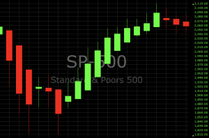
Candlestick charts are the most common form in software today. Green (or sometimes white) is usually used to depict bullish candles, where the current price is higher than the opening price. Red (or sometimes black) is common for bearish candles, where the current price is below the opening price. It shows the distance between the opening and closing prices (candle body) and the range of the daily volume (from the top of the wick to the bottom of the wick).
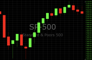
(Candlesticks show up and down movements in the S&P 500 index)
Open Low Open
A candlestick chart is similar to a close-low low chart, also known as a bar chart. But instead of the candle body showing the difference between the open and close prices, this level is represented by horizontal quotation marks. The price of the opening dot is on the left (to show that it comes from the past) while the price of the other price is to the right.
Area
An area chart is basically the same as a line chart, with the area underneath shaded. This is done more easily to visualize price movements than line charts.
Heiken-Ashi
The Heiken-Ashi chart uses candlesticks as a plotting medium, but takes a different mathematical price formula. From the candle standard procedure translated from the low open base criteria, the price has been diluted to show the price increase according to the formula:
- Open = (Open previous bar + Close previous bar) / 2
- Close = (Open + High + Low + Close) / 4
- High = Highest High, Open, or Close
- Low = Low Low, Open, or Close
General Conditions
Average true range – The range over a specific time period, usually daily. Breakout – When price breaks through a support or resistance area, often due to a significant jump in buying or selling volume. Cycle – A period in which price action is expected to follow a certain pattern.
Dead mouth cats – When prices drop in a down market, there may be price rises where buyers come to believe the asset is cheap or oversold. However, when sellers force the market further, the temporary buying spell is known as a dead cat.
Dow Theory – Examines the relationship between the Dow Jones Industrial Average (an index composed of 30 US multinational conglomerates) and the Dow Jones Transportation Average. Proponents of the theory state that when one of them moves in a certain direction, the others are likely to follow.
Many traders track the transportation sector as it can speak to the health of the economy. The high volume of trade and transaction of goods shows that the economy is in a strong position. A similar indicator is the Baltic Drought Index. Doji – A type of candle that is characterized by little or no change between the open and close prices, which indicates anxiety in the market.
Elliott wave theory – Elliott wave theory suggests that markets go through predictable cycles of optimism and pessimism and so on for trading opportunities. Fibonacci Ratio – A number used as a guide to determine support and resistance.
Harmonic – Harmonic trading is based on the idea that price patterns repeat themselves and that turning points in the market can be identified through the Fibonacci sequence. Momentum – The rate of price change with respect to time. Price action – Price movement, as shown graphically through certain market charts.
Resistance – A price level where there are more sell orders, causing the price to bounce to a lower level. Sufficient buying activity, usually of increased volume, is often required to breach it. Retracement – Reversal of trend direction that occurs, expected to be temporary, often at support or resistance levels. Support – A price level at which a larger magnitude buy order can be placed, causing the price to bounce to an upward level.
The level will not hold if there is sufficient selling activity in excess of buying activity. Trend – A sustained price movement in one direction for an extended period of time.
Technical Analysis Indicators
Technical indicators involve several statistical and arithmetical transformations of price and / or volume data to provide a mathematical description of up / down movements, support and resistance levels, momentum, trends, deviations from tendencies, ratios, correlations, among other areas.
Some indicators also reflect sentiment, such as short interest, implied volatility, put/call ratio, “fear” or “greed”, etc. Technical indicators fall into several main categories, including price-based, edge-based, broad, and non-chart-based.
Based on price
Average Directional Index (ADX) – Measures trend strength based on absolute value. Average Directional Moving Average (ADXR) – Measures the rate of trend change. Commodity Code Index (CCI) – Identifies new trends or cyclical conditions. Coppock Curve – Momentum Indicator, initially intended to identify bottom lines in stock indices as part of a long-term trading approach.
MACD – Plots the relationship between two separate moving averages; designed as a momentum-following indicator. Momentum – The rate of change of price in relation to time. Moving Average – A weighted price average to show a trend over a series of values.
Relative Strength Index (RSI) – Momentum Oscillator standardized to a 0-100 scale designed to determine the rate of change over a specific time period. Stochastic Oscillator – Shows the current price of a security or index compared to the high and low prices of a user-defined range.
Used to determine overbought and oversold market conditions. Trix – Combines to show trends and momentum.
Volume based
Money Flow Index – Measures the flow of money into and out of a stock over a given period. Negative Volume Index – Designed to understand when “smart money” is active, under the assumption that smart money is most active on low volume days and inactive on high volume days. Indicators focus on daily levels when volume is down from the previous day.
On-Balance Volume – Uses volume to predict the next price change. Proponents of spot indicators believe in the idea that if volume changes with a weak reaction in the stock, price action is likely to follow. Positive Volume Index – Usually used in conjunction with a negative volume index, the indicator is designed to show when institutional investors are most active under their premises most likely to buy or sell when volume is low.
Focus on days when volume is up from the previous day. Williams Clustering / Distribution – Looking at divergences between security (or index) price and volume trends. This is designed to determine when a trader is accumulating or buying (selling). For example, when the price makes a new low and the indicator fails to also make a new low, this may be taken as an indication that accumulation (buying) is taking place.
Breadth
The site indicator determines how strong or shallow a market move is. Advance-Decline Line – Measures how many stocks advanced (gained value) in the index compared to the number of stocks that declined (lost value). If the index has gained value but only 30% of the stocks are up but 70% are down or neutral, that’s an indication that the buying is most likely happening only in certain sectors and not positive for the overall market. If 98% of stocks are up but only 2% are down or neutral on the open market, this is an indication that the market may be more trendless and “reversing to mean” day trading strategies may be more effective.
However, if the protracted advance/decline continues, it may mean the market could be trending. Arms Index (aka TRIN) – Combines the number of advancing or declining stocks with their volume according to the formula: (# of advancing stocks / # of declining stocks) / (volume of advancing stocks / total of declining stocks) Values below 1 are considered bullish; values above 1 are considered to be declining.
Trading volume is measured in the number of shares traded rather than the dollar amount, which is the central flaw in the indicator (it favors lower-priced stocks per share, which can trade in higher volumes). It is still displayed on the floor of the New York Stock Exchange.
McClellan Oscillator – Takes the ratio of advancing stocks minus declining stocks in an index and uses two separate weighted averages to arrive at a value. Mainly used when prices and oscillators diverge. For example, when price makes a low but the oscillator makes a new high, this can represent a buying opportunity. Conversely, when the price makes a new high but the oscillator makes a new low, this can represent a selling opportunity.
Overlay
The overlay indicator is placed on top of the original price chart. Bollinger Bands – Uses a simple moving average and two line plots two standard deviations above and below it to form a range. Often used by traders using a mean reversion strategy where the price moves above or below a group of “stretched” bands and is potentially expected to move back into the band. Channel – Two parallel trend lines set to depict a specific directional consolidating pattern.
A break above or below the channel can be interpreted as a sign of a new trend and potential trading opportunity. Fibonacci Lines – Support and resistance tools are generally created by plotting indicators from the highs and lows of recent trends. Ichimoku Cloud – Designed to be an “all-in-one” indicator that provides support and resistance, momentum, trends, and generates trading signals.
Moving Average – A trend line that changes based on new price inputs. For example, the 50-day simple moving average will represent the average price of the past 50 trading days. Exponential moving averages weigh more towards recent prices. Parabolic SAR – Meant to find short-term reversal patterns in the market.
Generally only recommended for trending markets. Pivot Points – Support and resistance levels determined from yesterday’s open, high, low and close. Usually used by day traders to find potential reversal levels in the market. Trend line – A slope line is formed from two or more peaks or troughs on a price chart. A break above or below the trendline may indicate a breakout.
Not based on Charts
Not all technical analysis is based on charts or arithmetic price changes. Some technical analysts rely on sentiment-based surveys from consumers and businesses to gauge likely prices. When investor sentiment is one way or the other, surveys can act as contrarian indicators.
If the market is very bullish, this may be taken as a sign that almost everyone is fully invested and some buyers remain outside to push the price further. This may indicate that prices are more likely to decline. Or at the very least, the risk associated with being a buyer is higher than if sentiment were stuck the other way.